
IELTS Academic Writing Task 1: Metal Prices Line Graph (Band 9 Sample)
This Academic Task 1 asks you to describe a line graph showing the monthly change in the prices of three metals over a year. Because the lines fluctuate, a band-9 response reports the overall trend and the key turning points rather than every value, and makes comparisons between the metals. Below is a model answer of roughly 190 words, followed by why it scores 9 on all four criteria.
Get your own IELTS essay graded by AI
Band scores on all four criteria, line-by-line corrections and a model rewrite — free to start.
01 · The task
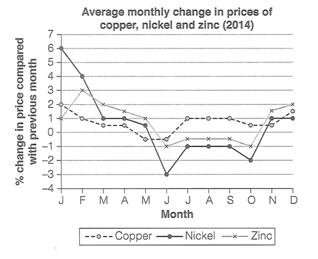
The graph below shows the average monthly change in the prices of three metals — copper, nickel and zinc — during 2014, measured as the percentage change compared with the previous month. Summarise the information by selecting and reporting the main features, and make comparisons where relevant.
02 · Band 9 sample answer
190 words · Band 9The line graph illustrates how the prices of copper, nickel and zinc changed month by month during 2014, expressed as the percentage change from the previous month.
Overall, all three metals began and ended the year with rising prices, but experienced a marked slump in the middle of the year. Nickel was consistently the most volatile of the three, whereas copper remained comparatively stable throughout.
At the start of the year, all three metals were increasing in price. Nickel saw the sharpest rise, at around 6% in January, followed by zinc, which peaked at about 3% in February, while copper crept up more modestly by roughly 1 to 2%. From this point, however, the rate of change fell steadily for all three.
The clearest common feature is the mid-year trough: prices bottomed out around June, when nickel plunged to approximately -3%, its lowest point of the year. Copper and zinc dipped only slightly below zero at this stage. The second half saw further fluctuation before all three metals climbed back to modest monthly gains of between 1 and 2% by December.
03 · Why this scores Band 9
The response captures the overall shape of a fluctuating graph — a rise, a mid-year slump and a recovery — in the overview, then reports the key turning points (the January peak, the June trough, the December recovery) with figures and clear comparisons between the three metals. It wisely reports trends rather than listing all thirty-six data points.
The report is organised by period — the start of the year, then the mid-year trough and recovery — which suits a time-series graph. Cohesion is natural and varied — "From this point, however...", "The clearest common feature is...", "at this stage", "The second half saw..." — so the reader follows the movement through the year.
Trend vocabulary is precise and varied — "the most volatile", "saw the sharpest rise", "crept up modestly", "the rate of change fell", "bottomed out", "plunged to", "climbed back to modest gains" — describing fluctuation with far more range than "went up" and "went down".
A range of structures presents the movement accurately: a relative clause ("zinc, which peaked at about 3% in February"), a "whereas" contrast ("whereas copper remained comparatively stable"), and hedging language for approximate values ("around", "roughly", "approximately"). The figures are reported without error.
04 · Useful collocations for this task
Tap a phrase to see what it means and how to use it. Natural collocations like these lift your Lexical Resource score.
05 · Frequently asked questions
How do I describe a graph that goes up and down a lot?
Do not report every wiggle. Give the overall shape in the overview (rise, slump, recovery), then pick out the key turning points — the peak, the trough and the end. Selecting trends over every value is what separates band 9 from a running commentary.
What does "% change compared with the previous month" mean for my answer?
It means the graph shows the rate of change, not the actual price. A value above zero means the price rose that month; below zero means it fell. Describe rises and falls in the rate, and note when a line crosses zero.
Should I use exact figures?
Use approximate figures with hedging — "around 6%", "approximately -3%" — for the key points. On a fluctuating graph, precise-looking numbers you cannot read exactly are risky; sensible estimates are expected.
How long should a Task 1 answer be?
At least 150 words; a band-9 answer is usually 170–200. This model is 190 words, enough for an overview and the main turning points with comparisons. Spend about 20 minutes on Task 1.
Want feedback on your own answer?
Toey grades your essay on Task, Coherence, Lexical Resource and Grammar, then shows exactly how to reach the next band — free to start.
Try the free IELTS Writing grader