
IELTS Academic Writing Task 1: Family Spending Bar Chart (Band 9 Sample)
This Academic Task 1 asks you to describe a bar chart comparing how families spent their weekly income across eight categories in 1968 and 2018. A band-9 response gives an overview of the main shifts, then reports the key figures and changes with comparisons. Below is a model answer of roughly 190 words, followed by why it scores 9 on all four criteria.
Get your own IELTS essay graded by AI
Band scores on all four criteria, line-by-line corrections and a model rewrite — free to start.
01 · The task
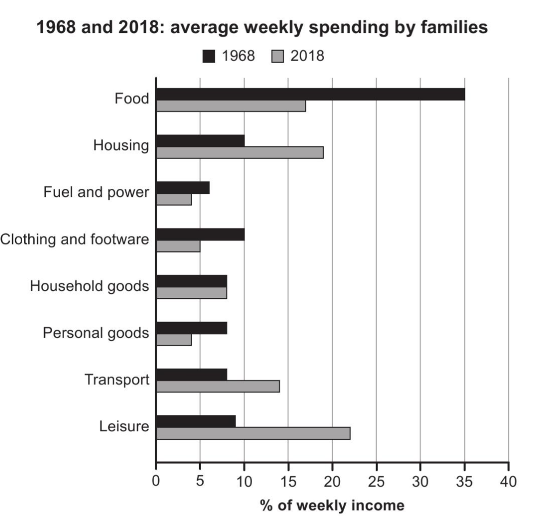
The bar chart below shows the average percentage of weekly income that families spent on eight categories of goods and services in 1968 and 2018. Summarise the information by selecting and reporting the main features, and make comparisons where relevant.
02 · Band 9 sample answer
191 words · Band 9The bar chart compares the proportion of their weekly income that families devoted to eight categories of spending in 1968 and 2018.
Overall, spending patterns shifted markedly over the fifty-year period. The share spent on food, which dominated household budgets in 1968, fell dramatically, while leisure and housing came to take up a far greater proportion of income.
In 1968, food was by far the largest expense, accounting for 35% of weekly income — more than three times any other category. By 2018, however, this had fallen sharply to just 17%. Leisure showed the opposite trend, more than doubling from 9% to 22% and replacing food as the single biggest category. Housing and transport also rose noticeably, from 10% to 19% and from 8% to 14% respectively.
The remaining categories either declined or held steady. Spending on clothing and footwear halved from 10% to 5%, personal goods dropped from 8% to 4%, and fuel and power fell slightly from 6% to 4%. Household goods, meanwhile, were the only category to remain unchanged, at 8% in both years.
03 · Why this scores Band 9
The response covers all eight categories, opens with an overview that captures the headline shift (food down, leisure and housing up), and then reports the significant figures for both years with comparisons. It groups the categories by whether they rose, fell or stayed the same rather than listing them at random.
The report is logically organised — overview, then a paragraph on the categories that rose and one on those that fell or held steady. Cohesion is smooth and varied — "which dominated household budgets in 1968", "showed the opposite trend", "also rose noticeably", "either declined or held steady" — guiding the reader through the comparison.
Data vocabulary is precise and varied — "devoted to", "dominated household budgets", "accounting for 35%", "fell dramatically", "more than doubling", "halved", "held steady" — describing change and proportion in several different ways rather than repeating "increased" and "decreased".
A range of structures presents the figures accurately: a non-defining relative clause ("food, which dominated household budgets in 1968, fell dramatically"), a participle phrase ("more than doubling from 9% to 22%"), and a "respectively" comparison ("from 10% to 19% and from 8% to 14% respectively"). The percentages are reported without error.
04 · Useful collocations for this task
Tap a phrase to see what it means and how to use it. Natural collocations like these lift your Lexical Resource score.
05 · Frequently asked questions
How do I handle a bar chart with two time periods and many categories?
Group the categories in your overview and body by their trend — those that rose, those that fell, those unchanged — rather than working through all eight in list order. Grouping is what makes the comparison read as band 9.
Which figures should I include?
The biggest and most striking — food's fall from 35% to 17%, leisure's rise from 9% to 22% — plus the category that did not change. You do not need to state every number for every category.
What tense should I use?
The past simple, because both years are in the past ("food was the largest expense", "leisure more than doubled"). Keep it consistent throughout.
How long should a Task 1 answer be?
At least 150 words; a band-9 answer is usually 170–200. This model is 191 words, enough for an overview and the key changes grouped by trend. Spend about 20 minutes on Task 1.
Want feedback on your own answer?
Toey grades your essay on Task, Coherence, Lexical Resource and Grammar, then shows exactly how to reach the next band — free to start.
Try the free IELTS Writing grader