IELTS Writing Task 1: How to Compare Data Effectively
If there is one skill that separates a Band 6 Task 1 response from a Band 7+, it is the ability to compare data — not just describe it. Examiners are not impressed by a list of statistics read off a chart. What they reward is a writer who groups information intelligently, highlights what is significant, and uses language that makes relationships between data points immediately clear.
This post breaks down exactly how to do that.
What the Examiner Is Actually Looking For
Task 1 Academic requires you to describe a visual — a chart, graph, table, map, or process diagram — in at least 150 words within 60 minutes (Task 1 and Task 2 share that hour, so budget around 20 minutes here).
Your response is marked on four criteria:
- Task Achievement — Did you cover the key features and compare where relevant?
- Coherence & Cohesion — Is the information logically organised and well-linked?
- Lexical Resource — Do you use a range of precise, appropriate vocabulary?
- Grammatical Range & Accuracy — Do you use varied structures correctly?
The word "compare" appears explicitly in the Task Achievement descriptor. At Band 6, a response "addresses the requirements of the task" but may not highlight the most significant data. At Band 7, you "clearly present and highlight key features" — which almost always means making explicit comparisons. That is the gap you need to close.
Step One: Read the Visual Before You Write a Single Word
Before touching your pen, spend 90 seconds asking three questions:
- What is the overall trend or dominant pattern? (This becomes your overview.)
- Which categories or time points differ the most from each other? (These are your comparison anchors.)
- Are there any exceptions or crossover points? (These add nuance and show analytical thinking.)
For example, if you see a line graph showing internet usage in four countries from 2000 to 2020, you might notice that Country A starts lowest but ends highest — a crossover that is far more interesting than simply listing each country's figures year by year.
Skipping this step is why many test-takers end up writing a mechanical tour of the chart rather than an analytical overview.
The Overview: Your Most Important Two Sentences
The overview is not a conclusion — it belongs near the beginning (after your introduction paraphrase), and it is where you state the big picture without any specific numbers. Examiners look for this explicitly.
A strong overview identifies the most striking comparison:
The most notable feature is that Country A experienced the sharpest rise over the period, ultimately surpassing all other nations by 2020, while Country D remained consistently the lowest throughout.
Notice what that sentence does: it compares (A vs. D), it uses a superlative ("sharpest rise"), and it gives a time reference. No numbers yet — those come in the body paragraphs.
Grouping Data: The Structural Move That Changes Everything
The single most effective structural decision you can make in Task 1 is to group data by similarity rather than describe category by category.
Imagine a bar chart showing the percentage of people using five modes of transport in two cities. A weak approach describes City A's figures for all five modes, then City B's. A strong approach groups: "modes where City A led significantly," then "modes where the two cities were broadly similar," then "the one mode where City B dominated."
This grouping strategy directly serves Task Achievement (you are highlighting key features, not just listing) and Coherence & Cohesion (your paragraphs have a clear logic).
Structurally, aim for:
- Paragraph 1 (Introduction): Paraphrase the question prompt — what the visual shows, the time frame, the unit of measurement.
- Paragraph 2 (Overview): The two or three most significant patterns or comparisons, no figures.
- Paragraph 3: First group of data with specific figures and comparisons.
- Paragraph 4: Second group, contrasting or adding detail.
You do not need a conclusion. The overview has already done that job.
Language That Makes Comparisons Precise
Vague comparison language is one of the most common Lexical Resource weaknesses. "More" and "less" are fine, but they are the baseline — not the target.
Comparing Quantities
Use modifiers to add precision to your comparisons:
Sales in Germany were roughly twice as high as those in Spain during the same period.
The proportion of car users was only marginally higher in London than in Paris, at 34% and 31% respectively.
The word "respectively" is powerful — it lets you pair two subjects with two figures in one clean sentence rather than two clunky ones.
Comparing Trends Over Time
When two lines move in opposite directions, say so explicitly:
While the number of train passengers rose steadily between 2005 and 2015, bus usage fell sharply over the same period.
The parallel structure (rose / fell, steadily / sharply) does two things: it creates a grammatical contrast that mirrors the data contrast, and it uses two different adverb-verb collocations that signal Lexical Resource range to the examiner.
Signalling Similarity
Not every comparison is a contrast. When two figures are close, say that too — it shows you are reading carefully:
The figures for France and Italy were broadly comparable, hovering around 40% throughout the decade.
Useful Comparison Phrases at a Glance
- To contrast: whereas, while, in contrast, by comparison, on the other hand
- To show similarity: similarly, likewise, both … and …, comparably
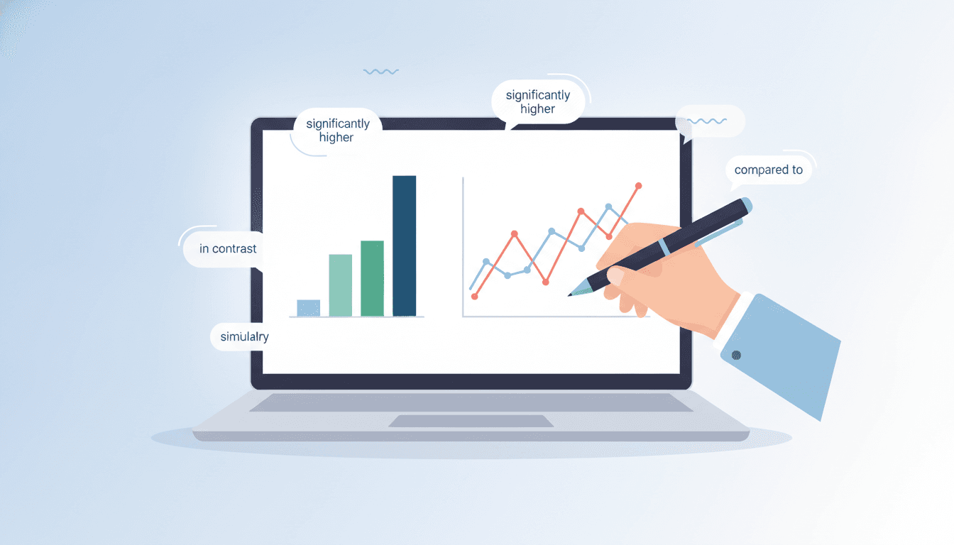
- To show degree: significantly higher/lower, marginally above/below, approximately double, nearly three times as much
- To reference two items together: respectively, at X% and Y% respectively
- To highlight an extreme: the highest/lowest figure was recorded in …, peaked at, reached a low of
Avoid overusing "however" — it is grammatically correct but it becomes a crutch. Rotate through "whereas," "while" (mid-sentence), and "in contrast" (sentence-initial) to show range.
Handling Tables and Multiple Charts
Tables and dual-chart tasks (e.g., a pie chart alongside a bar chart) are where comparison skills matter most, because the data is denser and the temptation to simply list everything is stronger.
For tables: identify the row or column with the highest and lowest values first, then look for any striking internal contrast (e.g., one country that bucks the general trend). You cannot report every cell — the examiner knows you know that — so selecting and comparing is the entire task.
For dual charts: the key move is to link the two visuals. If Chart A shows causes and Chart B shows effects, say so. If both charts share a category that behaves unexpectedly, highlight it across both.
While the bar chart shows that renewable energy accounted for just 15% of total production in 2010, the line graph reveals that investment in the sector had already been climbing steadily since 2005 — suggesting the impact of that investment took several years to materialise.
That sentence integrates two charts and offers a logical inference. It is exactly the kind of analytical language that pushes a response toward Band 7 and above.
The Grammar of Comparison: Two Structures Worth Mastering
Grammatical Range & Accuracy rewards variety, and comparison sentences are a natural place to show it.
Comparative adjectives with "than" — the standard form, but pair it with a precise modifier:
The unemployment rate in 2015 was considerably higher than it had been a decade earlier.
"The + comparative … the + comparative" — a more sophisticated structure that shows a relationship between two variables:
The older the age group, the lower the proportion of respondents who reported using social media daily.
That second structure is rare enough in Task 1 answers that it signals genuine grammatical range — use it once when the data genuinely supports a proportional relationship.
What to Avoid
Describing every data point in sequence. Examiners call this "lifting" — it shows no selection or analytical judgment. You will likely stay at Band 5–6 for Task Achievement.
Comparing without figures. Saying "Country A was higher than Country B" without any numbers is vague. Pin your comparisons to specific data: "at 62% compared to 41%."
Inventing trends. Only describe what the visual actually shows. If a line is flat, do not call it a "gradual increase" to make the writing feel more dynamic. Accuracy is part of Task Achievement.
Overloading one paragraph. If your third paragraph is eight sentences long and your fourth is two, the structure is unbalanced. Aim for roughly equal weight between your two body paragraphs.
Putting It Together
Effective comparison in Task 1 is not about knowing more vocabulary lists — it is about a mindset shift. You are not a transcription machine reading numbers off a chart. You are an analyst pointing out what matters and why it is interesting relative to something else.
That means grouping before you write, leading with an overview that makes a comparative claim, and choosing language that encodes the relationship between data points — not just the data points themselves.
When you approach a Task 1 question that way, the language and structure follow naturally. The phrases above are tools; the thinking behind them is the skill.
Frequently asked questions
Do I need to compare data in every IELTS Writing Task 1 response?
Almost always, yes. The Task Achievement descriptor at Band 7 explicitly requires you to 'clearly present and highlight key features' — and for most charts, tables, and graphs, the key features are defined by how categories or time periods relate to each other. Even for process diagrams, you can compare stages. The only exception is a single-line graph with one variable, where comparison is less central.
Where should the overview go in a Task 1 response?
Directly after your introduction (the paraphrase of the prompt). The overview states the two or three most significant patterns without specific numbers. It should not be saved for the end like a conclusion — examiners look for it early, and placing it there also helps you organise your body paragraphs more logically.
How many data points should I include in my comparisons?
Select, do not transcribe. For a chart with five categories, you might focus on the highest, the lowest, and one notable mid-range figure that contrasts with the others. Trying to mention every single data point leads to a list-style response that scores poorly on Task Achievement because it shows no analytical judgment.
Is it acceptable to use 'however' repeatedly to signal contrast?
Grammatically it is fine, but overusing it signals limited Lexical Resource. Examiners reward range. Rotate between 'whereas' (mid-sentence), 'while' (mid-sentence), 'in contrast' (sentence-initial), and 'by comparison' to demonstrate a wider repertoire of cohesive devices.
Can I give an opinion or interpretation in Task 1?
You should not give a personal opinion ('I think this shows…'), but you can make a factual inference when the data clearly supports it — for example, noting that a sharp rise in investment preceded a later increase in output. Keep any inference grounded in what the visual actually shows, and phrase it carefully ('this suggests…' rather than 'this proves…').
Toey
Verified coachToey is an AI-powered IELTS & TOEIC prep platform. Our guides are written with examiner-informed criteria and tested against thousands of real practice attempts.